
Some plant pots speak for themselves.
These painted terracotta pot ideas use steady lines, clear characters, and bold color to add personality without being messy.
From cartoons like Spiderman and Hello Kitty to food labels like Nutella and JIF, every pot tells its own story.
A few lean nostalgic.
Others are playful, soft, or pop-themed.
All of them hold a plant and still leave space for what matters.
You don’t need complicated shapes or extra add-ons. Just paint, a good base, and one clear idea.
Scroll through these 24 photo-matched designs and see which one fits your shelf or window.
 |
| save pin for later! |
What You Need To Paint Your Terracotta Pots


Painted Terracotta Plant Pot Ideas
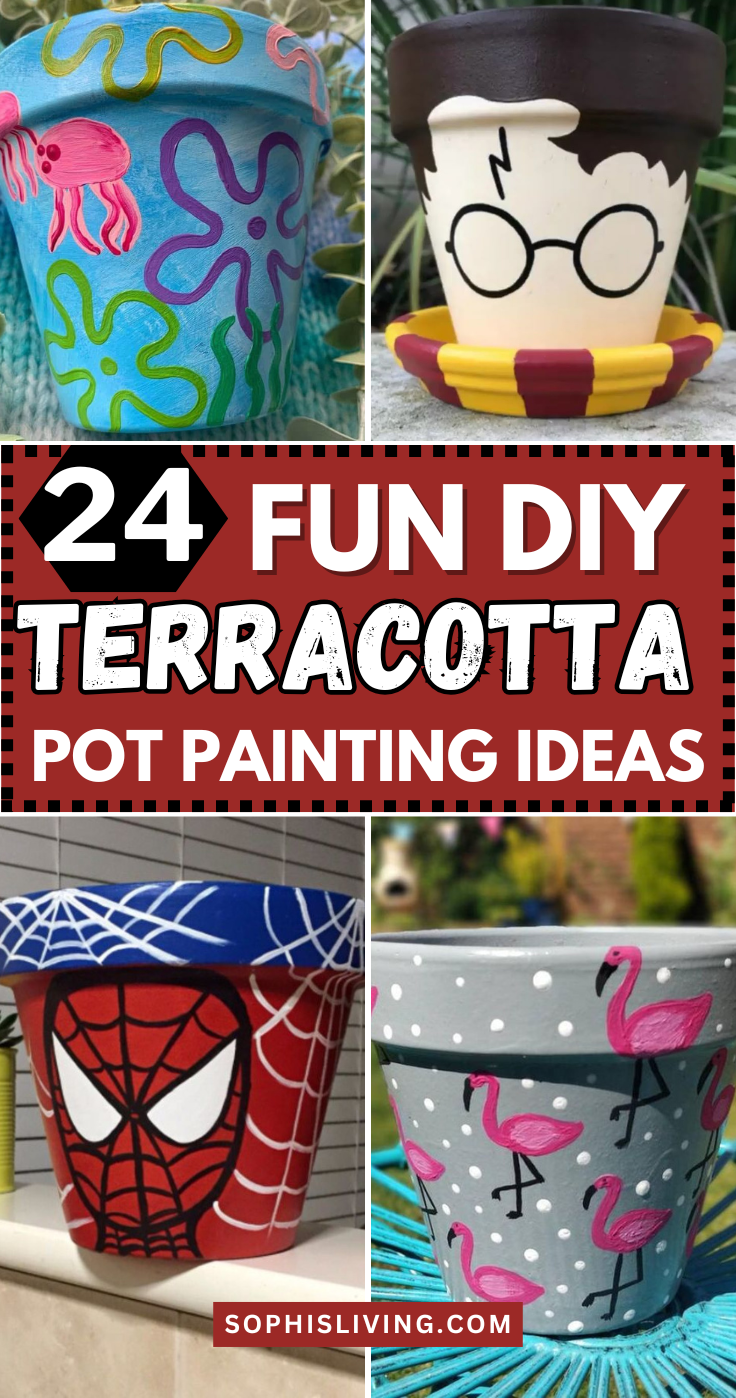
1. Cartoon Spiderman Pot
The face is centered and fills the main space.
It holds the classic look without too much detail.
It works best with green plants that contrast the red.
2. Hello Kitty Pot
The lines are clean and simple.
There’s no background clutter.
It’s a soft and familiar design that pairs well with flowers or succulents.
3. Orange SpongeBob Shop Pot
The outline is bold and square-shaped.
The small details like the window and door handle are clear but not overdone.
It gives the pot a themed entrance feel.
4. Mario Mushroom Pot
The white spots are rounded, and the eyes are spaced evenly.
The rest of the pot stays clean.
It fits well with small, round-leaf plants.
5. Batman Logo Pot
It is centered with even edges and no extra symbols.
The shape is crisp.
The design works on both small and medium pots without looking heavy.
6. Astronaut in Black Space Pot
Small white stars are dotted around the figure.
The astronaut’s helmet is round and clean.
The black space gives depth without taking over the design.
7. Harry Potter Face Pot
The design leaves out all other features.
It is subtle but easy to recognize.
A solid choice for a shelf or reading corner.
8. JIF Peanut Butter Pot
The label uses the red, blue, and green color blocks.
The wordmark is centered.
It gives the pot a kitchen or food-theme vibe.
9. SpongeBob Undersea Pot
The background is blue with small floating details.
The character's face and clothes are accurate.
It fits best near windows or playful corners.
10. Ice Cream Pot
The cone has a crisscross waffle pattern.
The shape follows the pot’s curve.
It’s light and simple with just enough detail.
11. Eeyore Face Pot
The eyes are low and relaxed, and his ears frame the sides.
The design uses round lines to keep it calm.
The overall feel is gentle and steady.
12. Heinz Ketchup Pot
The tomato graphic is clear, and the red paint is solid.
The font matches the original packaging.
It feels bold but familiar.
13. Angry Duck Pot
The eyebrows slant down, and the beak is painted mid-scowl.
The eyes are centered and bold.
The rest of the pot stays neutral.
14. Cherries + Pink Bows Pot
The fruits have tiny white highlights for shine.
The bows are placed evenly between the patterns.
It works well for plant lovers who like soft color.
15. Soap Bubbles Pot
Some are open circles, while others are filled in.
The lines stay soft.
It gives the pot a clean, light feel.
16. Balloon House Pot
The strings are thin and straight.
The balloons are round and placed close together.
The layout keeps the pot balanced.
17. Watermelon Pot
The top rim stays natural or white for contrast.
The seeds are oval and spaced out.
It looks clean and sharp without needing text.
18. Green + White Turtles Pot
Each turtle has a round shell and short legs.
The pattern repeats around the whole surface.
It’s quiet but steady.
19. Hermione Outline Pot
Her eyes, mouth, and nose are left blank.
The outline is soft but still shows movement.
It’s more suggestive than detailed.
20. Blue + Yellow Bees Pot
Each bee has black stripes and small wings.
The flight paths are drawn in short dashes.
The color mix feels bright but not too much.
21. Iron Man Face Pot
The angles are sharp, with clear lines around the eyes and jaw.
The design stays flat without shading.
It fits best on bold-colored shelves.
22. Grey + Pink Flamingo Pot
The legs are thin lines, and the necks curve in gentle shapes.
The pink contrasts against the grey background.
It’s steady and low-effort.
23. Nutella Pot
The red and black text stands out over the cream-colored background.
The bread and knife graphic is small but visible.
It fits kitchens or snack shelves.
24. Friends Window Pot
The background stays dark or neutral.
Read also: 16 Air Dry Clay Craft Ideas You Can Make, Sell, Or Use As Decor
It’s made to be subtle.
It matches well with small green houseplants.
 |
| save for later! |
Conclusion
These painted pots prove that one steady design can turn a plain planter into something personal.
Whether it’s a cartoon face, a food label, or just a small stack of flowers or bubbles, the message stays simple.
They work well for gifts, windows, study corners, or even kitchen herbs.
You can copy one directly or use them as a base to try your own version.
There’s no pressure to make it perfect.
Just pick a pot, find an idea that sticks, and paint with intention.
The design doesn’t need to do too much.
It just needs to feel like yours.


